(Source Code)3d Hover Button With Html & CSS

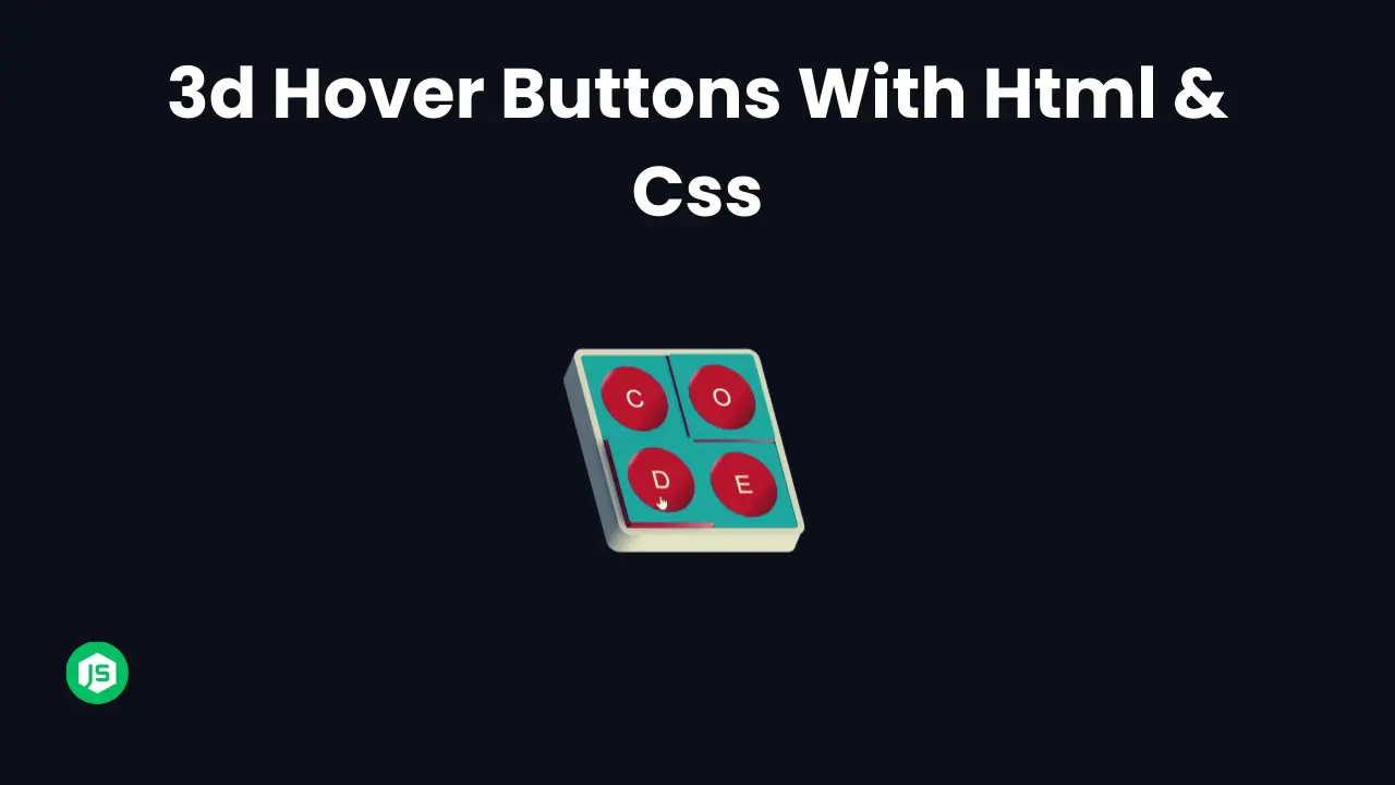
Hey Programmers! In this post, we will make a 3D Hover Button With HTML & CSS. There are fewer use cases of this project but the concepts that are used to make 3D hover buttons help you to level up your CSS skills.
Adding a 3D Hover Effect In Buttons is not just a cool visual effect but one of the best ways to dive deeper into CSS transformation, transition & perspective properties.
Also Read: Social Share Buttons With HTML & CSS
In this tutorial, we will walk through the entire process of creating a 3D Hover button that gives the illusion of depth & movement when we hover. At the end of this post, I will provide the entire source code so that you can run this project on your local machine.
Concepts Used To Make 3D Hover Button
- CSS Transform ( Rotate )
- CSS Transitions
- Setting Background Image CSS ( Background: URL(“”);
Also Read: Add To Cart Button With HTML & CSS
Understanding HTML To Make 3D Hover Button
- Container Div:
- The HTML contains a
divelement with the class “container”, wrapping the button. - Inside the container, there’s a
buttonelement with the class “btn” displaying the text “3D Button”.
   <div class="container">
       <button class="btn">3D Button</button>
   </div>
Also Read: Make Back To Top Button With HTML & CSS
Understanding CSS To Make 3D Hover Button
- Resetting Defaults:
- The CSS code begins with a universal selector
*,::before, and::after, resetting default padding, margin, and box-sizing to ensure consistent styling across different elements.
   *,
   ::before,
   ::after {
     padding: 0;
     margin: 0;
     box-sizing: border-box;
}- Container Styles:
- The
.containerclass styles the containerdiv. - It sets the width and height to 100% of the viewport height (
100vh) and applies a background image fetched from Unsplash. - The container is flexibly centered both horizontally and vertically using
justify-contentandalign-items. perspective: 1000px;creates a 3D perspective for child elements.
   .container {
     width: 100%;
     height: 100vh;
     background: white, url("https://source.unsplash.com/kcvEQb7GXZc") center no-repeat;
     background-size: cover;
     display: flex;
     justify-content: center;
     align-items: center;
     perspective: 1000px;
}- Button Styles:
- The
.btnclass styles the button element. - It sets the width and height of the button, applies a linear gradient background, and removes default border and outline.
- Various text styling properties like font-family, font-size, text-transform, letter-spacing, color, and text-shadow are applied to enhance the text appearance.
transform: rotateX(70deg) rotateZ(30deg);creates a 3D effect by rotating the button on the X and Z axes.transform-style: preserve-3d;ensures that child elements preserve their 3D transformations.transition: transform 0.5s ease-in-out;adds a smooth transition effect to the button’s transformations.
   .btn {
     width: 350px;
     height: 100px;
     background: linear-gradient(#853916, #6b3019);
     border: none;
     outline: none;
     font-family: "Slabo 27px", serif;
     font-size: 35px;
     text-transform: uppercase;
     letter-spacing: 4px;
     color: #fff;
     text-shadow: 0 10px 10px #000;
     cursor: pointer;
     transform: rotateX(70deg) rotateZ(30deg);
     transform-style: preserve-3d;
     transition: transform 0.5s ease-in-out;
}- Button Pseudo-elements:
- The
.btn::beforeand.btn::afterpseudo-elements are used to create additional visual effects for the button. - They generate pseudo-elements that act as layers positioned behind the button.
- These pseudo-elements use absolute positioning and transformations to create a 3D appearance.
   .btn::before {
     content: "";
     width: 100%;
     height: 15px;
     background-color: #6b3019;
     position: absolute;
     bottom: 0;
     right: 0;
     transform: rotateX(90deg);
     transform-origin: bottom;
   }

   .btn::after {
     content: "";
     width: 15px;
     height: 100%;
     background-color: #853916;
     position: absolute;
     top: 0;
     right: 0;
     transform: rotateY(-90deg);
     transform-origin: right;
}- Button Hover Effect:
- The
.btn:hoverselector defines the transformation applied to the button when hovered. - It changes the rotation angles to create an interactive 3D effect.
   .btn:hover {
     transform: rotateX(30deg) rotateZ(0deg);
   }
These CSS styles create a visually appealing 3D button with a hover effect, leveraging transforms and pseudo-elements for added depth and realism. The button is placed within a container that provides a 3D perspective, enhancing the overall visual impact.
Also Read: Make Download Button With Progress Bar
Source Code Of 3D Hover Button
HTML:
<div class="container">
    <button class="btn">3D Button</button>
  </div>
CSS:
<style>
    @import url("https://fonts.googleapis.com/css2?family=Slabo+27px&display=swap");

*,
::before,
::after {
  padding: 0;
  margin: 0;
  box-sizing: border-box;
}

.container {
  width: 100%;
  height: 100vh;
  background: white,
    url("https://source.unsplash.com/kcvEQb7GXZc") center no-repeat;
  background-size: cover;
  display: flex;
  justify-content: center;
  align-items: center;
  /* create 3d environment  */
  perspective: 1000px;
}

.btn {
  width: 350px;
  height: 100px;
  background: linear-gradient(#853916, #6b3019);
  border: none;
  outline: none;
  font-family: "Slabo 27px", serif;
  font-size: 35px;
  text-transform: uppercase;
  letter-spacing: 4px;
  color: #fff;
  text-shadow: 0 10px 10px #000;
  cursor: pointer;
  transform: rotateX(70deg) rotateZ(30deg);
  transform-style: preserve-3d;
  transition: transform 0.5s ease-in-out;
}

.btn::before {
  content: "";
  width: 100%;
  height: 15px;
  background-color: #6b3019;
  position: absolute;
  bottom: 0;
  right: 0;
  transform: rotateX(90deg);
  transform-origin: bottom;
}

.btn::after {
  content: "";
  width: 15px;
  height: 100%;
  background-color: #853916;
  position: absolute;
  top: 0;
  right: 0;
  transform: rotateY(-90deg);
  transform-origin: right;
}

.btn:hover {
  transform: rotateX(30deg) rotateZ(0deg);
}

  </style>
Last Updated: June 18, 2024


