Social Share Buttons With Hover Animation Effect ( Download Code )

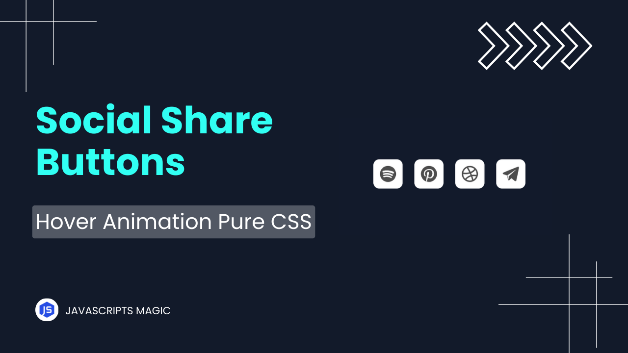
Hey Programmers! In this post, we will make social share buttons with Hover Animation. When we have to increase the engagement of the website then we can add social share buttons on our website. The Social Share Buttons Users To Easily Share their website on social media increasing overall engagement.
Also Read: Trash Button With Progress Bar With HTML & CSS
In this tutorial, we will make social share buttons with pure HTML & CSS with hover effects. We will understand all the required concepts that you need to make such projects on your own. At the end of this post, I will share the entire source code so that you can run this project on your local device.
Concepts Used To Make Social Share Buttons With Hover Animation Effect
- HTML SVG
- CSS Box Model & Flex Box
- CSS Border Radius & Box Shadow
- CSS Transition & Transform
- CSS Visibility
Also Read: Back To Top Button With HTML, CSS & JavaScript
Understanding HTML To Make Social Share Buttons
1. HTML Structure Of Social Share Buttons:
The code starts with a list (<ul>) that has the class example-2:
<ul class="example-2">The list items (<li>) within this unordered list represent different social media platforms, each containing a link (<a>), an SVG icon, and a tooltip.
2. List Item for Spotify
The first list item (<li>) represents a link to Spotify:
<li class="icon-content">- Link (
<a>): This link points to the Spotify website.
<a href="https://www.spotify.com/" aria-label="Spotify" data-social="spotify">href: The URL to navigate to when the icon is clicked.aria-label: A description for screen readers, providing accessibility.data-social: A custom attribute often used for JavaScript or CSS hooks.- Filled Div: This empty
<div>with classfilledcan be used for background or additional styling.
<div class="filled"></div>- SVG Icon: The SVG code creates a scalable vector icon for Spotify.
  <svg version="1.1" viewBox="0 0 100 100">
    <path d="..." fill="currentColor"></path>
</svg>version="1.1": Specifies the version of the SVG.viewBox="0 0 100 100": Defines the coordinate system and size of the SVG canvas.<path>: Defines the shape of the icon using a series of coordinates and commands.fill="currentColor"means the color will match the current text color.- Tooltip: This div with the class
tooltipprovides a text label that appears when you hover over the icon.
<div class="tooltip">Spotify</div>3. List Item for Pinterest
The second list item (<li>) is for Pinterest:
<li class="icon-content">- Link: The
<a>tag links to Pinterest.
<a href="https://www.pinterest.com/" aria-label="Pinterest" data-social="pinterest">- Filled Div: Again, an empty div for styling purposes.
<div class="filled"></div>- SVG Icon: The SVG provides the Pinterest icon.
  <svg version="1.1" viewBox="0 0 100 100" xml:space="preserve">
    <path d="..." fill="currentColor"></path>
</svg>xml:space="preserve": This attribute is used to control how white space is handled.- Tooltip: The tooltip text is “Pinterest”.
<div class="tooltip">Pinterest</div>4. List Item for Dribbble
The third list item is for Dribbble:
<li class="icon-content">- Link: The
<a>tag links to Dribbble.
<a href="https://dribbble.com/" aria-label="Dribbble" data-social="dribbble">- Filled Div: An empty div for styling.
<div class="filled"></div>- SVG Icon: The SVG defines the Dribbble icon.
  <svg version="1.1" viewBox="0 0 100 100">
    <path d="..." fill="currentColor"></path>
</svg>- Tooltip: The tooltip text is “Dribbble”.
<div class="tooltip">Dribbble</div>SVG Details
SVG Overview
SVG (Scalable Vector Graphics) is a vector image format. Each <path> element within the SVG uses a series of drawing commands to outline shapes. These are scalable, meaning they can be resized without losing quality.
SVG Path Attribute
Each <path> element’s d attribute defines the drawing instructions:
<path d="M50,4C24.7,4,4,24.7,4,50s20.6,46,46,46s46-20.6,46-46S75.4,4,50,4z M71.6,71.5c0,0,0,0.1-0.1,0.1c-0.8,1.2-2,1.8-3.2,1.8 c-0.7,0-1.4-0.2-2-0.6c-10.2-6.3-23.3-7.7-38.8-4.1c-2.1,0.6-4-0.9-4.5-2.7c-0.6-2.3,0.9-4.1,2.7-4.6c17.7-4,32.6-2.3,44.4,5 c0.9,0.4,1.5,1,1.8,1.9C72.2,69.3,72.1,70.5,71.6,71.5z M76.9,59.3L76.9,59.3c-0.8,1.1-1.9,1.9-3.2,2.1c-0.2,0-0.5,0.1-0.7,0.1 c-0.8,0-1.6-0.3-2.3-0.7c-12-7.3-30.1-9.4-43.9-5c-2.5,0.6-5-0.7-5.6-3c-0.6-2.5,0.7-4.9,3-5.5c16.5-5,37.2-2.5,51.4,6.2 c0.8,0.4,1.5,1.3,1.8,2.5C77.9,57,77.6,58.3,76.9,59.3z M83.2,45.6c-1,1.4-2.7,2.1-4.4,2.1c-0.9,0-1.9-0.2-2.7-0.7c0,0,0,0,0,0 c-13.9-8.3-37.8-9.3-51.4-5.1c-2.7,0.8-5.5-0.7-6.4-3.3c-0.8-2.7,0.7-5.6,3.3-6.4c16.2-4.8,43-3.8,59.8,6.2 C83.8,39.6,84.7,42.9,83.2,45.6C83.3,45.5,83.3,45.5,83.2,45.6z" fill="currentColor"></path>- Commands: These include
Mfor a move to, C for the curve to, L for the line to, and Z for the close path. - Coordinates: Each command is followed by coordinates to draw the shapes.
Also Read: Move To Trash Button With HTML, CSS & JavaScript
Understanding CSS To Make Social Share Buttons With Hover Animation Effect
.example-2 {
  list-style-type: none;
  padding: 0;
  display: flex;
  justify-content: center;
  gap: 40px;
}.example-2: This targets the<ul>element with the classexample-2.list-style-type: none;: Removes the default bullet points from the list items (<li>).padding: 0;: Removes any default padding from the<ul>to avoid extra space around it.display: flex;: Converts the<ul>into a flex container, allowing its children (<li>elements) to be arranged in a flexible layout.justify-content: center;: Centers the list items horizontally within the<ul>.gap: 40px;: Adds 40 pixels of space between each list item for better visual separation.
.icon-content {
  position: relative;
  width: 64px;
  height: 64px;
}.icon-content: This targets each list item (<li>) with the classicon-content.position: relative;: Sets the position of the list item relative to its normal position, which is useful for positioning child elements absolutely within it.width: 64px;: Sets the width of the list item to 64 pixels.height: 64px;: Sets the height of the list item to 64 pixels, ensuring each icon area is a square.
.icon-content svg {
  width: 100%;
  height: 100%;
  fill: #cfcfcf;
  transition: fill 0.3s;
}
.icon-content svg: This targets any<svg>element within a list item with the classicon-content.width: 100%;: Makes the SVG fill the entire width of its parent list item.height: 100%;: Makes the SVG fill the entire height of its parent list item.fill: #cfcfcf;: Sets the initial color of the SVG to a light gray (#cfcfcf).transition: fill 0.3s;: Adds a smooth transition effect of 0.3 seconds to the fill color, which makes the color change smoothly when hovered over.
.icon-content a {
  display: flex;
  align-items: center;
  justify-content: center;
  width: 100%;
  height: 100%;
  text-decoration: none;
  color: inherit;
}
.icon-content a: This targets the<a>elements within the list items.display: flex;: Converts the anchor tag into a flex container, allowing its contents to be easily centered.align-items: center;: Vertically centers the contents of the anchor tag.justify-content: center;: Horizontally centers the contents of the anchor tag.width: 100%;: Makes the anchor tag fill the full width of the list item.height: 100%;: Makes the anchor tag fill the full height of the list item.text-decoration: none;: Removes the default underline from the link text.color: inherit;: Ensures the text color of the anchor tag inherits the color of its parent element.
.icon-content .filled {
  position: absolute;
  width: 100%;
  height: 100%;
  background: rgba(52, 152, 219, 0.8);
  border-radius: 100%;
  transition: transform 0.3s;
  transform: scale(0);
}
.icon-content .filled: Targets the<div>with the classfilledwithin the list item.position: absolute;: Positions thedivabsolutely within its parent, allowing it to cover the entire area.width: 100%;: Makes thedivfill the full width of the list item.height: 100%;: Makes thedivfill the full height of the list item.background: rgba(52, 152, 219, 0.8);: Sets a semi-transparent blue background color for thediv.border-radius: 100%;: Makes thedivfully circular by setting the border radius to 100%.transition: transform 0.3s;: Adds a smooth transition effect of 0.3 seconds to the transform property.transform: scale(0);: Initially scales thedivdown to 0, making it invisible.
.icon-content:hover .filled {
  transform: scale(1.3);
}
.icon-content:hover .filled: Targets thedivwith the classfilledwhen the list item is hovered over.transform: scale(1.3);: Scales up thedivto 130% of its original size when hovered over, creating a zoom effect.
.icon-content:hover svg {
  fill: #fff;
}
.icon-content:hover svg: Targets the<svg>element within the list item when it is hovered over.fill: #fff;: Changes the fill color of the SVG to white when hovered over.
.icon-content .tooltip {
  position: absolute;
  top: 110%;
  left: 50%;
  transform: translateX(-50%);
  padding: 8px 12px;
  font-size: 12px;
  background: rgba(0, 0, 0, 0.8);
  color: #fff;
  border-radius: 5px;
  opacity: 0;
  pointer-events: none;
  transition: opacity 0.3s;
  white-space: nowrap;
}
.icon-content .tooltip: Targets the<div>with the classtooltipwithin the list item.position: absolute;: Positions the tooltip absolutely relative to its parent.top: 110%;: Positions the tooltip slightly below the parent list item.left: 50%;: Centers the tooltip horizontally relative to the parent.transform: translateX(-50%);: Adjusts the tooltip position to be exactly centered horizontally.padding: 8px 12px;: Adds padding inside the tooltip for spacing.font-size: 12px;: Sets the font size of the tooltip text.background: rgba(0, 0, 0, 0.8);: Sets a semi-transparent black background for the tooltip.color: #fff;: Sets the text color to white.border-radius: 5px;: Rounds the corners of the tooltip.opacity: 0;: Initially makes the tooltip invisible.pointer-events: none;: Prevents the tooltip from capturing mouse events.transition: opacity 0.3s;: Adds a smooth transition effect to the tooltip’s opacity.white-space: nowrap;: Prevents the tooltip text from wrapping to the next line.
.icon-content:hover .tooltip {
  opacity: 1;
}
.icon-content:hover .tooltip: Targets the tooltip when the list item is hovered over.opacity: 1;: Makes the tooltip visible by changing its opacity to 1.
Source Code Of Social Share Buttons
HTML:
  <ul class="example-2">
        <li class="icon-content">
          <a
            href="https://www.spotify.com/"
            aria-label="Spotify"
            data-social="spotify"
          >
            <div class="filled"></div>
            <svg> </svg>
          </a>
          <div class="tooltip">Telegram</div>
        </li>
      </ul>
Also Read: Add To Cart Button With HTML & CSS
CSS:
    ul {
  list-style: none;
}

.example-2 {
  display: flex;
  justify-content: center;
  align-items: center;
}
.example-2 .icon-content {
  margin: 0 10px;
  position: relative;
}
.example-2 .icon-content .tooltip {
  position: absolute;
  top: -30px;
  left: 50%;
  transform: translateX(-50%);
  color: #fff;
  padding: 6px 10px;
  border-radius: 15px;
  opacity: 0;
  visibility: hidden;
  font-size: 14px;
  transition: all 0.3s ease;
}
.example-2 .icon-content:hover .tooltip {
  opacity: 1;
  visibility: visible;
  top: -50px;
}
.example-2 .icon-content a {
  position: relative;
  overflow: hidden;
  display: flex;
  justify-content: center;
  align-items: center;
  width: 50px;
  height: 50px;
  border-radius: 20%;
  color: #4d4d4d;
  background-color: #ffff;
  transition: all 0.3s ease-in-out;
}
.example-2 .icon-content a:hover {
  box-shadow: 3px 2px 45px 0px rgb(0 0 0 / 50%);
}
.example-2 .icon-content a svg {
  position: relative;
  z-index: 1;
  width: 30px;
  height: 30px;
}
.example-2 .icon-content a:hover {
  color: white;
}
.example-2 .icon-content a .filled {
  position: absolute;
  top: auto;
  bottom: 0;
  left: 0;
  width: 100%;
  height: 0;
  background-color: #000;
  transition: all 0.3s ease-in-out;
}
.example-2 .icon-content a:hover .filled {
  height: 100%;
}
.example-2 .icon-content a[data-social="spotify"] .filled,
.example-2 .icon-content a[data-social="spotify"] ~ .tooltip {
  background-color: #1db954;
}
.example-2 .icon-content a[data-social="pinterest"] .filled,
.example-2 .icon-content a[data-social="pinterest"] ~ .tooltip {
  background-color: #bd081c;
}
.example-2 .icon-content a[data-social="dribbble"] .filled,
.example-2 .icon-content a[data-social="dribbble"] ~ .tooltip {
  background-color: #ea4c89;
}
.example-2 .icon-content a[data-social="telegram"] .filled,
.example-2 .icon-content a[data-social="telegram"] ~ .tooltip {
  background-color: #0088cc;
}
Last Updated: June 18, 2024


