Bubble Loading Animation With HTML & CSS 3 ( Download Code )
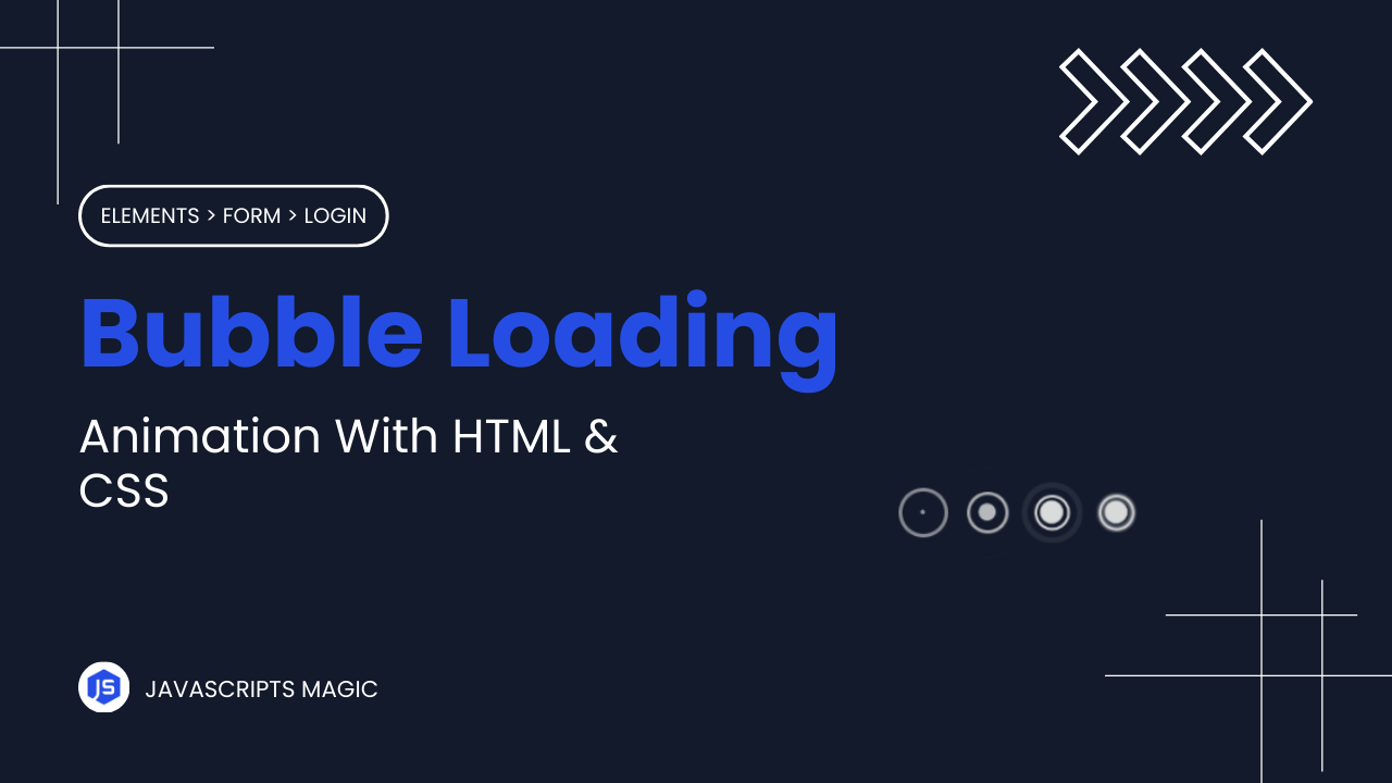
Hey! Programmers, In This Post we are going to make Bubble Loading Animation With HTML & CSS. In this tutorial we will be focusing on the concepts that are used to make creative animation like keyframes, transform, etc
Bubble Loading animation can increase the user experience of website by engaging users till the content of application loads. This reduce the bounce rate & dwell time which are helpsfull to increase the SEO Of your website.
Also Read: Book Loading Animation With HTML & CSS
In this blog post we will understand HTML & CSS Code step by step so that you can make such project on your own. At the last of this project I will share the source code of this bubble loading animation so that you can run this on your local machine.
Concepts Used In Bubble Loading Animation
- CSS Keyframes & Animation
- CSS Border Radius
- CSS Transform
- CSS Nth Child
- CSS FlexBox & Box Model
- CSS Position, etc
Understanding HTML Structure Of Bubble Loading Animation
The HTML structure creates a loader with multiple animated circles for our bubble loading animation :
- Loader Container:
- The
divwith the classloaderis the main container for the loading animation. It holds multiplecircleelements.
<div class="loader">- Circle Elements: Inside the
loadercontainer, there are fourdivelements with the classcircle. Eachcirclecontains adotand anoutline, which are used for the animations.
   <div class="circle">
     <div class="dot"></div>
     <div class="outline"></div>
   </div>
   <div class="circle">
     <div class="dot"></div>
     <div class="outline"></div>
   </div>
   <div class="circle">
     <div class="dot"></div>
     <div class="outline"></div>
   </div>
   <div class="circle">
     <div class="dot"></div>
     <div class="outline"></div>
   </div>
Understanding CSS Of Bubble Loading Animation
- Loader Styling: The
.loaderclass usesdisplay: flexto align thecircleelements horizontally. Thejustify-content: centerandalign-items: centerproperties center the circles within the container. Custom properties (CSS variables) are defined:--colorfor the circle color and--animationfor the animation timing.
   .loader {
     display: flex;
     justify-content: center;
     align-items: center;
     --color: hsl(0, 0%, 87%);
     --animation: 2s ease-in-out infinite;
}- Circle Styling: The
.circleclass sets up the basic shape and size of each circle. It positions the circles relatively and sets a border with the color defined by--color. Theanimation: circle-keys var(--animation)applies thecircle-keyskeyframe animation to each circle.
   .loader .circle {
     display: flex;
     align-items: center;
     justify-content: center;
     position: relative;
     width: 20px;
     height: 20px;
     border: solid 2px var(--color);
     border-radius: 50%;
     margin: 0 10px;
     background-color: transparent;
     animation: circle-keys var(--animation);
}- Dot Styling: The
.dotclass is positioned absolutely within thecircleand centered usingtransform: translate(-50%, -50%). It is smaller than the circle, with a background color matching--color. Theanimation: dot-keys var(--animation)applies thedot-keyskeyframe animation to each dot.
   .loader .circle .dot {
     position: absolute;
     transform: translate(-50%, -50%);
     width: 16px;
     height: 16px;
     border-radius: 50%;
     background-color: var(--color);
     animation: dot-keys var(--animation);
}- Outline Styling: The
.outlineclass is also positioned absolutely within thecircle, with the same transform and positioning as thedot. Theanimation: outline-keys var(--animation)applies theoutline-keyskeyframe animation to each outline.
   .loader .circle .outline {
     position: absolute;
     transform: translate(-50%, -50%);
     width: 20px;
     height: 20px;
     border-radius: 50%;
     animation: outline-keys var(--animation);
}- Animation Delays:
- Each
circleand its children (dotandoutline) have different animation delays set usingnth-childselectors to create a staggered effect. - This means each circle starts its animation slightly after the previous one, creating a wave-like motion.
   .circle:nth-child(2) {
     animation-delay: 0.3s;
   }

   .circle:nth-child(3) {
     animation-delay: 0.6s;
   }

   .circle:nth-child(4) {
     animation-delay: 0.9s;
   }

   .circle:nth-child(5) {
     animation-delay: 1.2s;
   }

   .circle:nth-child(2) .dot {
     animation-delay: 0.3s;
   }

   .circle:nth-child(3) .dot {
     animation-delay: 0.6s;
   }

   .circle:nth-child(4) .dot {
     animation-delay: 0.9s;
   }

   .circle:nth-child(5) .dot {
     animation-delay: 1.2s;
   }

   .circle:nth-child(1) .outline {
     animation-delay: 0.9s;
   }

   .circle:nth-child(2) .outline {
     animation-delay: 1.2s;
   }

   .circle:nth-child(3) .outline {
     animation-delay: 1.5s;
   }

   .circle:nth-child(4) .outline {
     animation-delay: 1.8s;
   }

   .circle:nth-child(5) .outline {
     animation-delay: 2.1s;
}- Keyframes for Circle Animation:
- The
@keyframes circle-keysanimation changes thetransformproperty to scale the circle and adjusts itsopacity. - This creates a pulsing effect where the circle grows and then shrinks back to its original size.
   @keyframes circle-keys {
     0% {
       transform: scale(1);
       opacity: 1;
     }

     50% {
       transform: scale(1.5);
       opacity: 0.5;
     }

     100% {
       transform: scale(1);
       opacity: 1;
     }
}- Keyframes for Dot Animation:
- The
@keyframes dot-keysanimation scales thedotfrom its original size down to zero and then back to its original size. - This creates a blinking effect for the dot.
   @keyframes dot-keys {
     0% {
       transform: scale(1);
     }

     50% {
       transform: scale(0);
     }

     100% {
       transform: scale(1);
     }
}- Keyframes for Outline Animation:
- The
@keyframes outline-keysanimation scales theoutlinefrom zero to its full size while adjusting theoutlineproperty andoutline-offsetto create a growing and fading effect. - This makes the outline expand and then fade out.
   @keyframes outline-keys {
     0% {
       transform: scale(0);
       outline: solid 20px var(--color);
       outline-offset: 0;
       opacity: 1;
     }

     100% {
       transform: scale(1);
       outline: solid 0 transparent;
       outline-offset: 20px;
       opacity: 0;
     }
   }
Source Code Of Bubble Loading Animation
HTML:
<div class="loader">
  <div class="circle">
    <div class="dot"></div>
    <div class="outline"></div>
  </div>
  <div class="circle">
    <div class="dot"></div>
    <div class="outline"></div>
  </div>
  <div class="circle">
    <div class="dot"></div>
    <div class="outline"></div>
  </div>
  <div class="circle">
    <div class="dot"></div>
    <div class="outline"></div>
  </div>
</div>
Also Read: Radar Loading Animation With HTML & CSS
CSS:
.loader {
  display: flex;
  justify-content: center;
  align-items: center;
  --color: hsl(0, 0%, 87%);
  --animation: 2s ease-in-out infinite;
}

.loader .circle {
  display: flex;
  align-items: center;
  justify-content: center;
  position: relative;
  width: 20px;
  height: 20px;
  border: solid 2px var(--color);
  border-radius: 50%;
  margin: 0 10px;
  background-color: transparent;
  animation: circle-keys var(--animation);
}

.loader .circle .dot {
  position: absolute;
  transform: translate(-50%, -50%);
  width: 16px;
  height: 16px;
  border-radius: 50%;
  background-color: var(--color);
  animation: dot-keys var(--animation);
}

.loader .circle .outline {
  position: absolute;
  transform: translate(-50%, -50%);
  width: 20px;
  height: 20px;
  border-radius: 50%;
  animation: outline-keys var(--animation);
}

.circle:nth-child(2) {
  animation-delay: 0.3s;
}

.circle:nth-child(3) {
  animation-delay: 0.6s;
}

.circle:nth-child(4) {
  animation-delay: 0.9s;
}

.circle:nth-child(5) {
  animation-delay: 1.2s;
}

.circle:nth-child(2) .dot {
  animation-delay: 0.3s;
}

.circle:nth-child(3) .dot {
  animation-delay: 0.6s;
}

.circle:nth-child(4) .dot {
  animation-delay: 0.9s;
}

.circle:nth-child(5) .dot {
  animation-delay: 1.2s;
}

.circle:nth-child(1) .outline {
  animation-delay: 0.9s;
}

.circle:nth-child(2) .outline {
  animation-delay: 1.2s;
}

.circle:nth-child(3) .outline {
  animation-delay: 1.5s;
}

.circle:nth-child(4) .outline {
  animation-delay: 1.8s;
}

.circle:nth-child(5) .outline {
  animation-delay: 2.1s;
}

@keyframes circle-keys {
  0% {
    transform: scale(1);
    opacity: 1;
  }

  50% {
    transform: scale(1.5);
    opacity: 0.5;
  }

  100% {
    transform: scale(1);
    opacity: 1;
  }
}

@keyframes dot-keys {
  0% {
    transform: scale(1);
  }

  50% {
    transform: scale(0);
  }

  100% {
    transform: scale(1);
  }
}

@keyframes outline-keys {
  0% {
    transform: scale(0);
    outline: solid 20px var(--color);
    outline-offset: 0;
    opacity: 1;
  }

  100% {
    transform: scale(1);
    outline: solid 0 transparent;
    outline-offset: 20px;
    opacity: 0;
  }
}
Last Updated: June 18, 2024
