Cool Email Input Field With Pure HTML & CSS
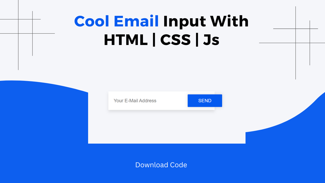
Hi! Programmers, In this blog post we are going to make a cool Email Input Field with pure HTML & CSS. Have you ever come across a stylish email input field on a web application & wondered how it was created?
Wonder No more! In this tutorial, we will make such a cool email Input field. We will achieve a clean and modern look for our email input from defining the root variables to setting up hover effects.
Also Read: OTP Input Feild With Pure HTML & CSS
We will walk through concepts like CSS flex Box, Box Shadow & CSS Box Model. This blog post explains important concepts used in the project step by step. At the last I will provide the entire source code so that you can run this project on your local machine.
Concepts Used To Make Cool Email Input Field
- HTML Form
- CSS Box Shadow, Box Model & Felx Bpx
- Border Radius & Box Shadow
- CSS Transition
Understanding HTML To Make Email Input Field
The HTML code sets up a simple form layout with an email input field and a send button. The elements are organized within a container to ensure a clean and centered presentation.
<div class="container">
    <div class="container__item">
        <form class="form">
            <input type="email" class="form__field" placeholder="Your E-Mail Address" />
            <button type="button" class="btn btn--primary btn--inside uppercase">Send</button>
        </form>
    </div>
</div>
<div class="container">: This acts as the main container for centering the form on the page.<div class="container__item">: A sub-container that holds the form.<form class="form">: The form element, which includes the email input and send button.<input type="email" class="form__field" placeholder="Your E-Mail Address" />: An input field for the user to enter their email address.<button type="button" class="btn btn--primary btn--inside uppercase">Send</button>: A button styled as a primary button with text in uppercase.
Understanding CSS To Make Email Input Field
The CSS defines the styles for the container, form, input field, and button. It uses various properties to ensure a modern, clean, and user-friendly design.
Root and Global Styles
These styles set the basic appearance for the body and the overall page layout.
:root {
    background: #f5f6fa;
    color: #9c9c9c;
    font: 1rem "PT Sans", sans-serif;
}

html, body, .container {
    height: 100%;
}:root: Defines global variables for background color, text color, and font settings.html, body, .container: Ensures the container fills the entire height of the viewport.
Link Styles
These styles control the appearance of links within the page.
a {
    color: inherit;
}

a:hover {
    color: #7f8ff4;
}
color: inherit: Makes links take on the parent element’s text color.color: #7f8ff4: Changes the link color to a blue shade when hovered.
Container and Flexbox
The container class uses flexbox to center the content both horizontally and vertically.
.container {
    display: flex;
    flex-direction: column;
    align-items: center;
    justify-content: center;
}
display: flex: Sets the container to use Flexbox for layout.flex-direction: column: Stacks child elements vertically.align-items: center: Centers child elements horizontally.justify-content: center: Centers child elements vertically.
Uppercase Text
This class ensures that any text using it will be converted to uppercase.
.uppercase {
    text-transform: uppercase;
}
text-transform: uppercase: Converts text to uppercase.
Button Styles
The button classes define the appearance, hover effects, and active state for the button.
.btn {
    display: inline-block;
    background: transparent;
    color: inherit;
    font: inherit;
    border: 0;
    outline: 0;
    padding: 0;
    transition: all 200ms ease-in;
    cursor: pointer;
}

.btn--primary {
    background: #7f8ff4;
    color: #fff;
    box-shadow: 0 0 10px 2px rgba(0, 0, 0, .1);
    border-radius: 2px;
    padding: 12px 36px;
}

.btn--primary:hover {
    background: #6c7ff2;
}

.btn--primary:active {
    background: #7f8ff4;
    box-shadow: inset 0 0 10px 2px rgba(0, 0, 0, .2);
}

.btn--inside {
    margin-left: -96px;
}.btn: Basic button styles, including no background, inherited color, and cursor change on hover..btn--primary: Styles for the primary button, including background color, text color, box shadow, border-radius, and padding..btn--primary:hover: Changes the button background color when hovered..btn--primary:active: Modifies the button background color and adds an inset box shadow when the button is clicked..btn--inside: Adjusts the button position by using a negative left margin.
Form Field
This class styles the input field for the form, ensuring it is visually appealing and easy to use.
.form__field {
    width: 360px;
    background: #fff;
    color: #a3a3a3;
    font: inherit;
    box-shadow: 0 6px 10px 0 rgba(0, 0, 0, .1);
    border: 0;
    outline: 0;
    padding: 22px 18px;
}
width: 360px: Sets the width of the input field.background: #fff: Sets a white background for the input field.color: #a3a3a3: Sets the text color inside the input field.box-shadow: Adds a shadow around the input field for a 3D effect.padding: 22px 18px: Adds padding inside the input field for better spacing.
Practical Tips
- Customization: You can change the colors, sizes, and fonts by modifying the CSS variables and styles.
- Responsiveness: Ensure the form is responsive by using percentages or relative units for widths and by testing on different devices.
- Accessibility: Add labels to form elements and ensure that text contrasts sufficiently with backgrounds for readability.
- Testing: Test the form on various browsers to ensure consistent appearance and functionality.
Source Code OF Cool Email Input Field
HTML CODE:
<div class="container">
	<div class="container__item">
		<form class="form">
			<input type="email" class="form__field" placeholder="Your E-Mail Address" />
			<button type="button" class="btn btn--primary btn--inside uppercase">Send</button>
		</form>
	</div>

</div>
CSS:
<style>
    :root {
	 background: #f5f6fa;
	 color: #9c9c9c;
	 font: 1rem "PT Sans", sans-serif;
}
 html, body, .container {
	 height: 100%;
}
 a {
	 color: inherit;
}
 a:hover {
	 color: #7f8ff4;
}
 .container {
	 display: flex;
	 flex-direction: column;
	 align-items: center;
	 justify-content: center;
}
 .uppercase {
	 text-transform: uppercase;
}
 .btn {
	 display: inline-block;
	 background: transparent;
	 color: inherit;
	 font: inherit;
	 border: 0;
	 outline: 0;
	 padding: 0;
	 transition: all 200ms ease-in;
	 cursor: pointer;
}
 .btn--primary {
	 background: #7f8ff4;
	 color: #fff;
	 box-shadow: 0 0 10px 2px rgba(0, 0, 0, .1);
	 border-radius: 2px;
	 padding: 12px 36px;
}
 .btn--primary:hover {
	 background: #6c7ff2;
}
 .btn--primary:active {
	 background: #7f8ff4;
	 box-shadow: inset 0 0 10px 2px rgba(0, 0, 0, .2);
}
 .btn--inside {
	 margin-left: -96px;
}
 .form__field {
	 width: 360px;
	 background: #fff;
	 color: #a3a3a3;
	 font: inherit;
	 box-shadow: 0 6px 10px 0 rgba(0, 0, 0, .1);
	 border: 0;
	 outline: 0;
	 padding: 22px 18px;
}

</style>
Last Updated: June 18, 2024
