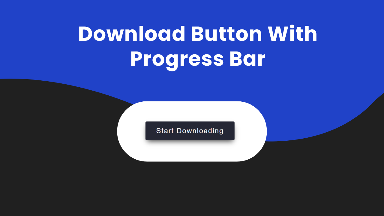
Create Download Button With Progress Bar

Hey Programmers! In this post, we will make a Download Button With Progress Bar with pure HTML, CSS & JavaScript. Such buttons can be very useful when we have to create a website where users need to download medium or large files.
Imagine a condition when the user clicks on the download button and user can see just a static button which is a bad user experience. In this tutorial, we will create a download button with a dynamic progress bar that gives users real-time feedback on the download process.
Also Read: Social Share Buttons With HTML & CSS
We will understand each step of the code step by step so that you can use this concept to create new projects like this. At the end, I will provide the entire source code of this project so that you can run this on your local machine.
Concepts Used To Make Download Button With Progress Bar
- CSS Box Model
- CSS Animation & Keyframes
- CSS Before & After
- JavaScript Set Time Out
- JavaScript Classlist toggle
Also Read: Add To Cart Button With HTML, CSS & JavaScript
Understanding HTML To Make Download Button With Progress Bar
<div class="root">: This div acts as a container for the button.<div class="button">: This div is styled to look like a button and contains the text “Start Downloading”.
Also Read: Download Button With Progress Bar
Understanding CSS To Make Download Button With Progress Bar
- Root Element Custom Property:
- The
:rootselector defines a custom property--bouncewith a cubic-bezier value. - This property is used to control the animation timing function for certain elements.
   :root {
     --bounce: cubic-bezier(0.175, 0.885, 0.32, 1.1);
}- Global Styling:
- The
*selector applies thefont-familyproperty to all elements, setting the font to ‘Poppins’ or a fallback sans-serif font.
   * {
     font-family: 'Poppins', sans-serif;
}- Body Styling:
- The
bodyselector styles the body element, making it a flex container with center alignment.
   body {
     height: 100vh;
     display: flex;
     justify-content: center;
     align-items: center;
}- Root Container Styling:
- The
.rootclass styles the root container div. - It sets the display to flex and aligns items to the end (bottom) of the container.
   .root {
     display: flex;
     align-items: end;
}- Button Styling:
- The
.buttonclass styles the button element. - It sets the height, background color, padding, cursor, text color, font size, letter spacing, font weight, and border radius.
- Transition properties define smooth animations for hover and progress states.
   .button {
     height: 100%;
     background-color: #252735;
     padding: 1rem 2rem;
     cursor: pointer;
     color: white;
     font-size: 1.35rem;
     letter-spacing: .075em;
     font-weight: 500;
     border-radius: .25rem;
     transition: 300ms;
     ...
}- Button Hover Effect:
- On hover, the button rotates around the bottom edge using the
transformproperty.
   .button:hover {
     transform-origin: bottom;
     transform: rotate3d(1, 0, 0, 20deg);
}- Button Progress State Styling:
- When the button is in a progress state (
.progressclass), it undergoes changes in height, background color, and transitions. - The progress animation is achieved using keyframes for reducing height and loading.
   .button.progress {
     ...
   }

   .button.progress::before {
     ...
   }

   .button.progress::after {
     ...
}- Button Completed State Styling:
- Once the progress is complete, the button changes its appearance to indicate completion.
- The background color changes, and an animation snaps the underline into place.
   .button.progress.done {
     ...
   }

   .button.progress.done::before {
     ...
   }

   .button.progress.done::after {
     ...
}- Keyframe Animations:
- Keyframes define animations for reducing height, loading progress, and snapping the underline.
   @keyframes reduceHeight {
     ...
   }

   @keyframes load {
     ...
   }

   @keyframes snapUnderline {
     ...
   }
These CSS styles create a visually appealing button with hover and progress animations, as well as special styling for different states such as progress and completion. The button is designed to be responsive and user-friendly.
Also Read: Trash Button With HTML & CSS
Source Code Of Download Button With Progress Bar
HTML:
<div class="root">
    <div class="button">
      Start Downloading
    </div>
  </div>
CSS:
 <style>
    :root {
  --bounce: cubic-bezier(0.175, 0.885, 0.32, 1.1);
}
* {
  font-family: 'Poppins', sans-serif;
}

body {
  height: 100vh;
  display: flex;
  justify-content: center;
  align-items: center;
}

.root {
  display: flex;
  align-items: end;
}

.button {
  height: 100%;
  background-color: #252735;
  padding: 1rem 2rem;
  cursor: pointer;
  color: white;
  font-size: 1.35rem;
  letter-spacing: .075em;
  font-weight: 500;
  border-radius: .25rem;
  transition: 300ms;
  box-shadow: 0 8px 16px -5px rgba(0,0,0, .75);
}

.button:hover {
  transform-origin: bottom;
  transform: rotate3d(1, 0, 0, 20deg);
}

.button.progress {
  position: relative;
  background-color: #B3BACA;
  height: 100%;
  font-size: 0px;
  padding: .25rem 5rem;
  border-radius: 1rem;
  transition: 300ms;
  transform-origin: bottom;
  box-shadow: none;
  animation: reduceHeight .5s var(--bounce) forwards;
}

.button.progress::before {
  content: "";
  position: absolute;
  width: 100%;
  height: 100%;
  margin: -.25rem -5rem;
  border-radius: 1rem;
  background-color: #3653f9;
  transform-origin: left;
  transform: scaleX(0%);
  animation: load 2.5s ease-in-out .5s forwards;
}

.button.progress.done {
  position: relative;
  background-color: transparent;
}

.button.progress.done::before{
  content: "";
  position: absolute;
  width: 100%;
  height: 100%;
  margin: -.25rem -5rem;
  border-radius: 1rem;

  background-color: #252735;
  transform-origin: center;
  animation: snapUnderline .5s var(--bounce) forwards;
}

.button.progress.done::after {
  content: "Completed!";
  position: absolute;
  font-size: 1.35rem;
  font-weight: 500;
  display: flex;
  margin-top: -2.5rem;
  margin-left: -3.15rem;
  justify-content: center;
  color: #252735;
}

@keyframes reduceHeight {
    from {
        height: 100%;
    }
    to {
        height: 2%;
    }
}

@keyframes load {
    from {
        transform: scaleX(0%);
    }
    to {
        transform: scaleX(100%);
    }
}

@keyframes snapUnderline {
  from {
    transform: scaleX(100%);
    margin-top: -.25rem;
    height: 100%;
  }
  to {
    transform: scaleX(80%);
    margin-top: -.5rem;
    height: 40%;
  }
}


  </style>
JavaScript:
 <script>
    let button = document.querySelector(".button");

const handler = () => {
    button.classList.toggle("progress");
    button.textContent = "";
    setTimeout(() =>{
      button.classList.toggle("done");
    }, 3500);
    button.removeEventListener("click", handler);
}

button.addEventListener("click", handler);
  </script>
Last Updated: August 12, 2024


