(Code) Glassmorphism Cards With Hover Animation

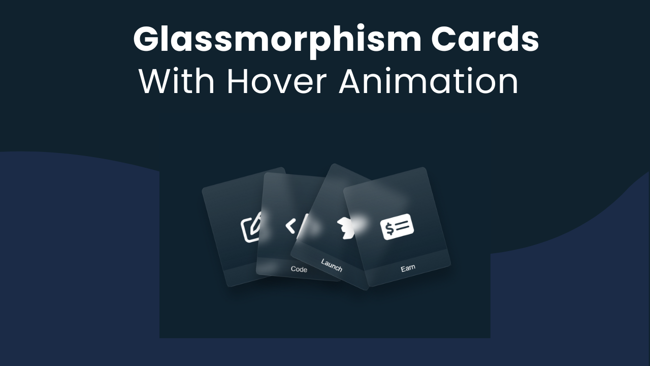
Hey Programmers! In this post, we will make stunning Glassmorphism Cards With Hover Animation using pure HTML & CSS. Glassmorphism is a design trend that is inspired by the look of frosted glass, which helps your designs stand out.
There is not too much use of this project while building commercial applications but this concept can be used when you have to make online games to showcase content.
Also Read: Gradient Glowing Cards With Hover Effect
Also, it can help to clear your CSS concepts like hover animation, interactive elements, etc. These cards will look sleek & stylish & when we hover over them they will animate smoothly to showcase their content in a unique way.
Concepts Used To Make Glassmorphism Cards With Hover Animation
- CSS Glassmorphism Effect
- CSS Transform
- CSS Flexbox
- CSS Hover Animation
Also Read: Make Gradient Glowing Cards With Hover Effects
Understanding HTML To Make Glassmorphism Cards With Hover Animation
Also Read: Animated Wallet Card With HTML & CSS
Understanding CSS To Make Glassmorphism Cards With Hover Animation
Understanding JavaScript To Make Glassmorphism Cards With Hover Animation
Source Code Of Glassmorphism Cards With Hover Animation
HTML:
<!DOCTYPE html>
<html>
<head>
    <meta charset="UTF-8" />
    <title>title</title>
    <link rel="stylesheet" href="https://cdnjs.cloudflare.com/ajax/libs/font-awesome/6.4.2/css/all.min.css" integrity="sha512-z3gLpd7yknf1YoNbCzqRKc4qyor8gaKU1qmn+CShxbuBusANI9QpRohGBreCFkKxLhei6S9CQXFEbbKuqLg0DA==" crossorigin="anonymous" referrerpolicy="no-referrer" />
</head>
<body>
    <div class="container">
        <div class="glass" style="--r:-15;" data-text="Design">
            <i class="fa-regular fa-pen-to-square"></i>
        </div>
        <div class="glass" style="--r:5;" data-text="Code">
            <i class="fa-solid fa-code"></i>
        </div>
        <div class="glass" style="--r:25;" data-text="Launch">
            <i class="fa-solid fa-rocket"></i>
        </div>
        <div class="glass" style="--r:-15;" data-text="Earn">
            <i class="fa-solid fa-money-check-dollar"></i>
        </div>
    </div>
</body>
</html>
CSS:
<style>
    *{
    margin: 0;
    padding: 0;
    box-sizing: border-box;
    font-family: 'Poppins', sans-serif;
}

body{
    display: flex;
    justify-content: center;
    align-items: center;
    min-height: 100vh;
    background: #0f222f;
}

.container{
    position: relative;
    display: flex;
    justify-content: center;
    align-items: center;
}

.container .glass{
    position: relative;
    width: 200px;
    height: 240px;
    background: linear-gradient(#fff2, transparent);
    border: 1px solid rgba(255,255,255,0.1);
    box-shadow: 0 25px 25px rgba(0,0,0,0.25);
    backdrop-filter: blur(10px);
    display: flex;
    justify-content: center;
    align-items: center;
    transition: 0.5s;
    border-radius: 10px;
    margin: 0 -45px;
    transform: rotate(calc(var(--r) * 1deg));
}

.container:hover .glass{
    transform: rotate(0deg);
    margin: 0 20px;
}

.container .glass:before{
    content: attr(data-text);
    position: absolute;
    bottom: 0;
    width: 100%;
    height: 40px;
    background: rgba(255,255,255,0.05);
    display: flex;
    justify-content: center;
    align-items: center;
    color: #fff;
}

.container .glass i{
    font-size: 4em;
    color: #fff;
}
</style>
Last Updated: June 18, 2024


