How To Hide The Sidebar On Mobile In Blogger
by JSM Hemant |
July 24, 2025
Hide sidebar on mobile blogger
If you’re using Blogger and your blog has a sidebar, then you might have noticed that it looks fine on Desktops but becomes messy on mobile devices.
On Small Screens, The Sidebar Takes Too Much Space, Makes The Layout Look Crowded, And Honestly, It Doesn’t Give A Good Experience To The User.
Sidebars Are Super Useful Especially On Desktop. They Help Show Related Posts, Ads, Social Links, Widgets, And More… All In One Place. But On Mobile, The Story Is Different.
Most Blogger Themes Move The Sidebar Below The Main Content On Mobile Screens. That Means — Users Have To Scroll Through The Entire Post Just To See The Sidebar. And Let’s Be Real — Most Of Them Don’t Even Reach That Far.
So What’s The Solution?
The Best Option Is To Hide The Sidebar Only On Mobile Devices.
This makes your blog look cleaner, more focused, and more professional on phones and tablets.
And If You Still Want To Suggest Related Content, Just Place Some Internal Links Between Paragraphs.
It Works Just Like A Sidebar, But Feels More Natural On Mobile.
How To Hide The Sidebar On Mobile

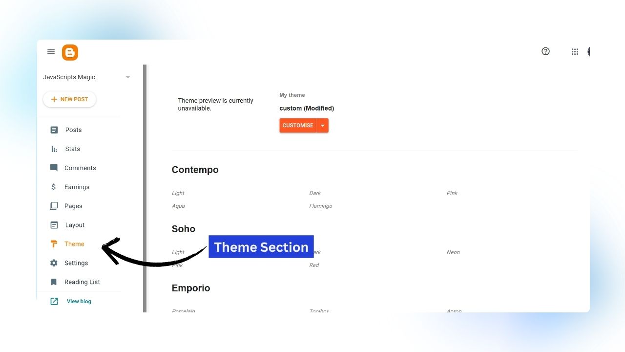
Step 1
Go To Blogger Dashboard And Click On “Theme” Section as shown in above image.

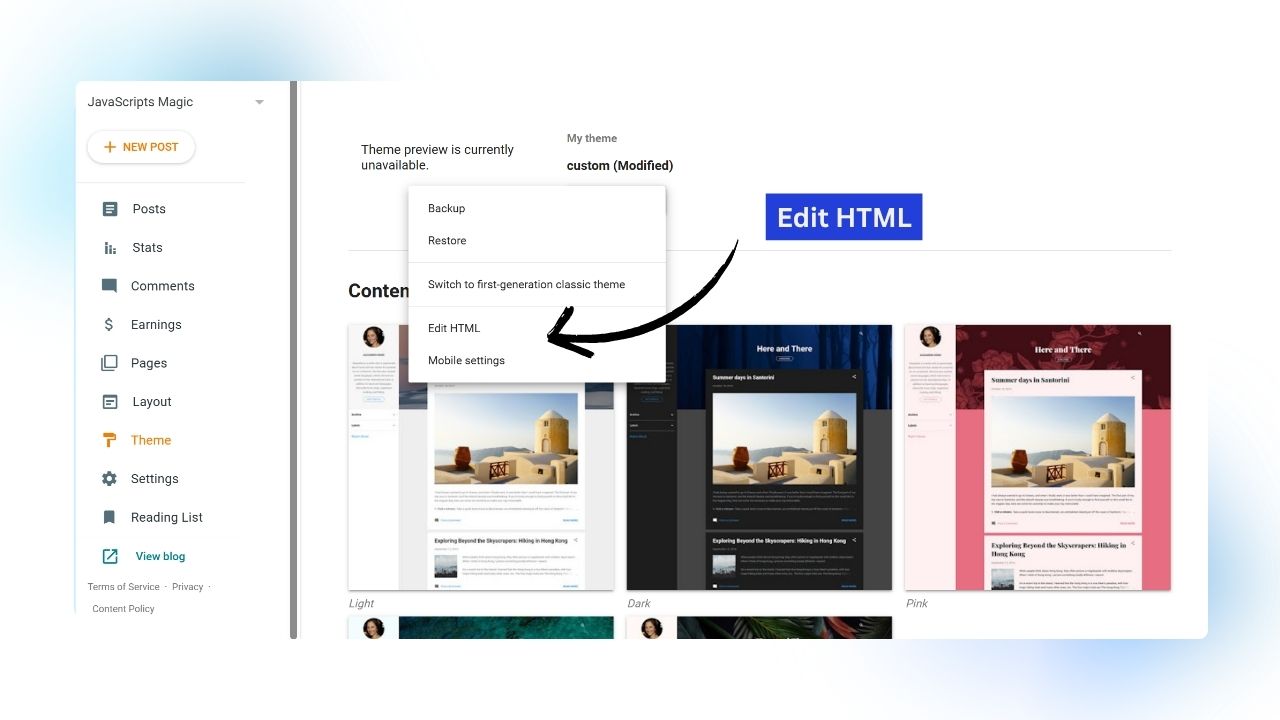
Step 2
Now Click On Customize > Edit As HTML As shown in above image.

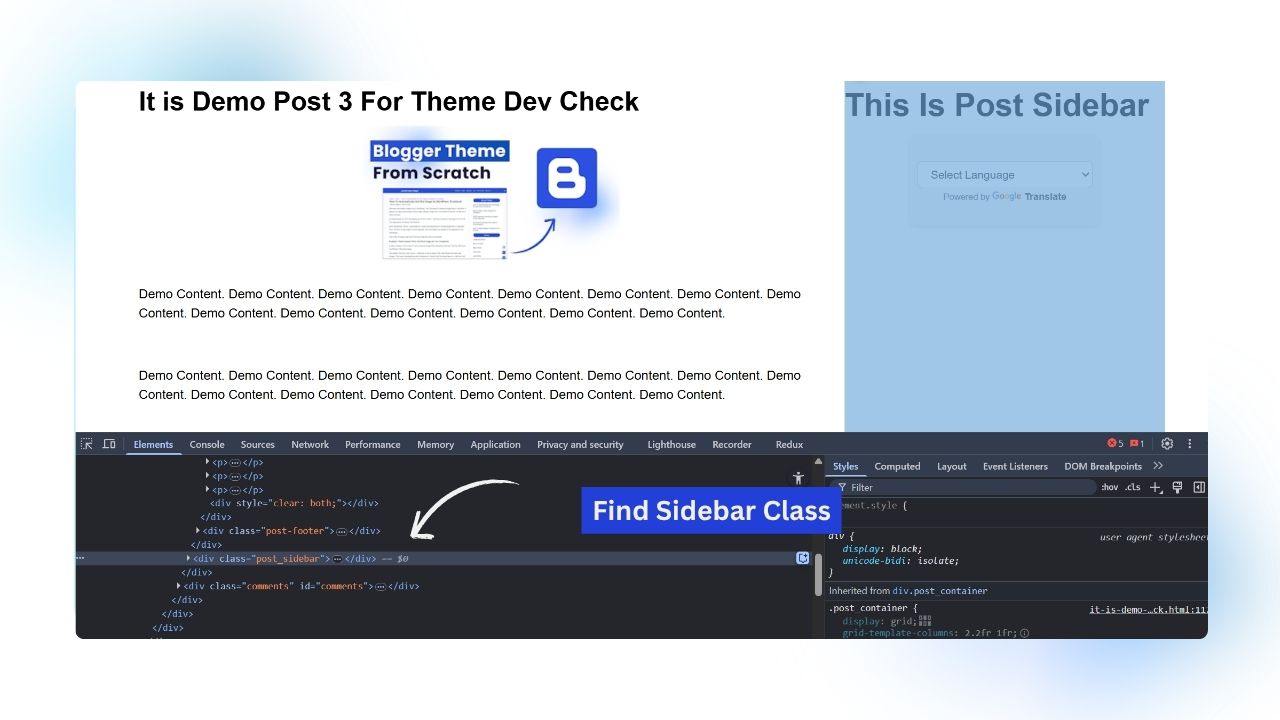
Step 3
Now Open new tab and open the web inspect element by pressing F12 or right click on page and click on Inspect option. As you open the chrome web inspector then find the CLASS Or ID of the sidebar which we want to hide on mobile as shown in above image.

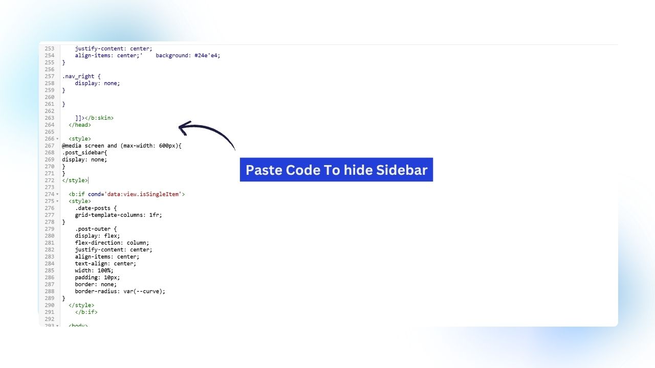
Step 4
Now we have found the class of the sidebar now go to the blogger theme editor and put this CSS code in after head section as shown in above image:
<style>
@media screen and (max-width: 600px){
.post_sidebar{
display: none;
}
}
</style>
Step 5
We have successfully hidden the sidebar on mobile which is of less use in mobile. To check this resize the window or check your website on mobile as shown in above image. You can add other mobile friendly elements or widget instead of that long sidebar.
How To Check Sidebar Is Hidden In Mobile?
After You Apply The CSS Code To Hide The Sidebar On Mobile Devices. You Need To Double-Check Whether The Sidebar Is Actually Gone On Mobile Screens Or Not.
Here Are Two Simple Ways To Test It:
- Use Chrome’s Mobile View (Responsive Mode)
Right Click Anywhere On Your Blog And Click On “Inspect” In The Developer Tools Panel, Click The Mobile/Tablet Icon (Top-Left Corner). Select A Mobile Device Like iPhone X Or Pixel 5 From The Dropdown
Now Refresh The Page, If You Don’t See The Sidebar Below Your Content — It Means Your Theme Is Hiding It Properly.
- Check On A Real Mobile Phone
Open Your Website On A Real Phone Using Chrome Or Safari. Go To Any Page Where Sidebar Usually Appears. Scroll Through The Page. If The Sidebar Isn’t Visible Even At The Bottom — Then You’re Good To Go. Your Code Is Working As Expected.
Why Hide Sidebar On Mobile?
Mobile Screens Are Small And Every Pixel Counts. When Your Blog Loads On Mobile, Showing The Sidebar Along With The Main Content Can Make Things Feel Cluttered. t Pushes Important Content Down, Makes Scrolling Longer, And Distracts The Reader.
That’s Why It’s A Smart Move To Hide Sidebar On Mobile. Here’s What You Gain:
- Better Readability
- Faster Page Load
- Clean User Experience
- Longer Dwell Time, Lower Bounce Rate
Alternatives To Show Instead Of Sidebar In Blogger
Sidebars Look Good On Desktop But On Mobile, They Just Don’t Work Well. They Take Too Much Space, Break The Layout, And Most Users Never Scroll Down Far Enough To See Them.
So Instead Of Using A Long Sidebar On Mobile, Try These Smart Widgets That Keep Things Functional — Without Cluttering The Screen:
- Sticky Bottom Navigation
- Floating Social Media Icons
- Related Post Grid
- Sticky Next Post
- Floating CTA Buttons
Final Words How To Hide Sidebar On Blogger
Hiding The Sidebar On Mobile May Look Like A Small Change. But It Can Seriously Improve The Mobile Experience Of Your Blog. Your Blog Will Load Faster, The Layout Will Look Cleaner, And Most Importantly Readers Will Stay Focused On The Main Content
And The Best Part? You Don’t Need To Do a Lot Of Coding Changes. This Whole Thing Takes Less Than 5 Minutes.
Just Follow The Steps I Shared Above — And You’ll Have A Neat, Mobile-Friendly Blog In No Time!