How To Make Slider In HTML And CSS Without JavaScript

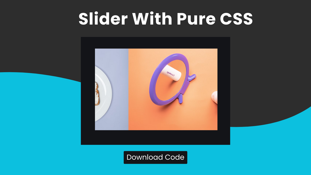
Hey Programmers! In this post, we will make sliders In HTML And CSS without JavaScript. Sliders are the best way to display a series of images or content in the form of cards in a compact and yet interactive way.
Image having a clean & dynamic slideshow intro your web dev project without using JavaScript. Sounds Interesting, Right? This post will help you to understand the entire project step by step so that you can create a project like this on your own.
At the end of this post, you will have the entire source code of this project & skills to add a cool slider to your website.
Concepts Used To Make Slider With HTML & CSS Without Js
- CSS Animations & Keyframes
- CSS ~ & CSS : Target
- CSS Transform
- CSS Opacity & Hover
Also Read: How To Convert Google Sheet ( Excel sheet ) Into Api
Understanding HTML To Make Slider With HTML & CSS Without Js
The HTML code creates a simple image slider with buttons for navigation. Here is a step-by-step breakdown:
- Slider Container:
- The
divwith the classslide-containeris the main container for the slider. It houses all the images and navigation buttons.
<div class="slide-container">- Slider Markers:
- There are five
spanelements with uniqueidattributes (slider1toslider5). These serve as anchors or targets for the buttons, allowing navigation to specific images.
   <span id="slider1"></span>
   <span id="slider2"></span>
   <span id="slider3"></span>
   <span id="slider4"></span>
<span id="slider5"></span>- Image Container:
- The
divwith the classimage-containerholds the images for the slider. It contains fiveimgelements, each with a classslider-imageand a unique identifier (onetofive).
   <div class="image-container">
       <img src="..." alt="" class="slider-image one">
       <img src="..." alt="" class="slider-image two">
       <img src="..." alt="" class="slider-image three">
       <img src="..." alt="" class="slider-image four">
       <img src="..." alt="" class="slider-image five">
</div>- Button Container:
- The
divwith the classbutton-containercontains buttons that link to each slider marker. Each button is an anchor (a) with a classslider-buttonthat links to the correspondingspanid (#slider1to#slider5).
   <div class="button-container">
       <a href="#slider1" class="slider-button"></a>
       <a href="#slider2" class="slider-button"></a>
       <a href="#slider3" class="slider-button"></a>
       <a href="#slider4" class="slider-button"></a>
       <a href="#slider5" class="slider-button"></a>
   </div>
Also Read: How To Make CV With HTML & CSS
Understanding CSS To Make Slider With HTML & CSS Without Js
The CSS code styles the slider, providing layout and animation for the images. Here’s a detailed breakdown:
- Body Styling:
- The
bodyselector sets the background color, removes margins and padding, centers the text, and hides overflow content.
   body {
     background-color: #131418;
     margin: 0;
     padding: 0;
     text-align: center;
     overflow: hidden;
}- Slide Container:
- The
slide-containerclass sets the dimensions, centers the container vertically usingtransform: translateY(-50%), and hides overflow content to ensure only one image is visible at a time.
   .slide-container {
     margin: 50vh auto 0 auto;
     transform: translateY(-50%);
     width: 600px;
     height: 450px;
     overflow: hidden;
}- Image Styling:
- The
imgselector ensures each image takes up 20% of theimage-containerwidth, even though only one image is visible at a time due to the container’s dimensions and overflow settings.
   img {
     width: 20%;
}- Image Container:
- The
image-containerclass sets the dimensions, positions the container relatively, and specifies a transition for theleftproperty. Theanimation: slide 15s infiniteapplies a sliding animation that cycles through the images.
   .image-container {
     display: inline-block;
     width: 3000px;
     height: 400px;
     position: relative;
     transition: left 1s;
     animation: slide 15s infinite;
}- Slider Image:
- The
slider-imageclass floats each image to the left, placing them side by side within theimage-container.
   .slider-image {
     float: left;
}- Button Container:
- The
button-containerclass positions the container relatively and adjusts its top margin.
   .button-container {
     position: relative;
     top: 10px;
}- Slider Buttons:
- The
slider-buttonclass styles the navigation buttons, giving them a small size, round shape, and semi-transparent white background. A hover effect lightens the background color.
   .slider-button {
     height: 10px;
     width: 10px;
     margin: 4px;
     display: inline-block;
     border-radius: 5px;
     background-color: rgba(255, 255, 255, 0.5);
   }

   .slider-button:hover {
     background-color: rgba(255, 255, 255, 0.7);
}- Image Positioning with Targets:
- Each
#sliderX:target ~ .image-containerrule shifts theimage-containerleftward by a multiple of 600 pixels when the corresponding target is active. This displays the appropriate image in the container.
   #slider1:target ~ .image-container {
     left: 0px;
   }
   #slider2:target ~ .image-container {
     left: -600px;
   }
   #slider3:target ~ .image-container {
     left: -1200px;
   }
   #slider4:target ~ .image-container {
     left: -1800px;
   }
   #slider5:target ~ .image-container {
     left: -2400px;
}- Image Container Hover Effect:
- The
.image-container:hoverrule could have adjusted the animation duration or paused it, but it is commented out here.
   .image-container:hover {
     // animation: slide 10s infinite;
}- Keyframes for Sliding Animation:
- The
@keyframes slidedefines an animation that moves theimage-containerleftward in stages, creating a sliding effect that loops every 15 seconds.css @keyframes slide { 0% { left: 0; } 20% { left: -600px; } 40% { left: -1200px; } 60% { left: -1800px; } 80% { left: -2400px; } 100% { left: 0; } }
- The
Source Code Of Slider With HTML & CSS Without Js
HTML:
<div class="slide-container">
    <span id="slider1"></span>
    <span id="slider2"></span>
    <span id="slider3"></span>
    <span id="slider4"></span>
    <span id="slider5"></span>
    <div class="image-container">
      <img src="https://images.unsplash.com/flagged/photo-1556667885-a6e05b14f2eb?ixlib=rb-1.2.1&auto=format&fit=crop&w=1950&q=80" alt="" class="slider-image one">
      <img src="https://images.unsplash.com/photo-1556815054-cd8e705a758e?ixlib=rb-1.2.1&auto=format&fit=crop&w=1350&q=80" alt="" class="slider-image two">
      <img src="https://images.unsplash.com/photo-1556228721-e65f06ab45c8?ixlib=rb-1.2.1&auto=format&fit=crop&w=1350&q=80" alt="" class="slider-image three">
      <img src="https://images.unsplash.com/photo-1556228578-626e9590b81f?ixlib=rb-1.2.1&ixid=eyJhcHBfaWQiOjEyMDd9&auto=format&fit=crop&w=1350&q=80" alt="" class="slider-image four">
      <img src="https://images.unsplash.com/photo-1556228454-1690896f350c?ixlib=rb-1.2.1&ixid=eyJhcHBfaWQiOjEyMDd9&auto=format&fit=crop&w=1350&q=80" alt="" class="slider-image five">
    </div>
    <div class="button-container">
      <a href="#slider1" class="slider-button"></a>
      <a href="#slider2" class="slider-button"></a>
      <a href="#slider3" class="slider-button"></a>
      <a href="#slider4" class="slider-button"></a>
      <a href="#slider5" class="slider-button"></a>
    </div>
  </div>
CSS:
 <style>
    body {
  background-color: #131418;
  margin: 0;
  padding: 0;
  text-align: center;
  overflow: hidden;
}
.slide-container {
  margin: 50vh auto 0 auto;
  transform: translateY(-50%);
  width: 600px;
  height: 450px;
  overflow: hidden;
}
img {
  width: 20%;
}

.image-container {
  display: inline-block;
  width: 3000px;
  height: 400px;
  position: relative;
  transition: left 1s;

  animation: slide 15s infinite;
}
.slider-image {
  float: left;
}

.button-container {
  position: relative;
  top: 10px;
}

.slider-button {
  height: 10px;
  width: 10px;
  margin: 4px;
  display: inline-block;
  border-radius: 5px;
  background-color: rgba(white, 0.5);
}
.slider-button:hover {
  background-color: rgba(white, 0.7);
}

#slider1:target ~ .image-container {
  left: 0px;
}
#slider2:target ~ .image-container {
  left: -600px;
}
#slider3:target ~ .image-container {
  left: -1200px;
}
#slider4:target ~ .image-container {
  left: -1800px;
}
#slider5:target ~ .image-container {
  left: -2400px;
}

.image-container:hover {
  // animation: slide 10s infinite;
}

@keyframes slide {
  0% {
      left: 0;
  }
  20% {
      left: -600px;
  }
  40% {
      left: -1200px;
  }
  60% {
      left: -1800px;
  }
  80% {
      left: -2400px;
  }
  100% {
      left: 0;
  }
}
  </style>
Last Updated: June 18, 2024


