(Source Code) Light Bulb Switch With Pure CSS
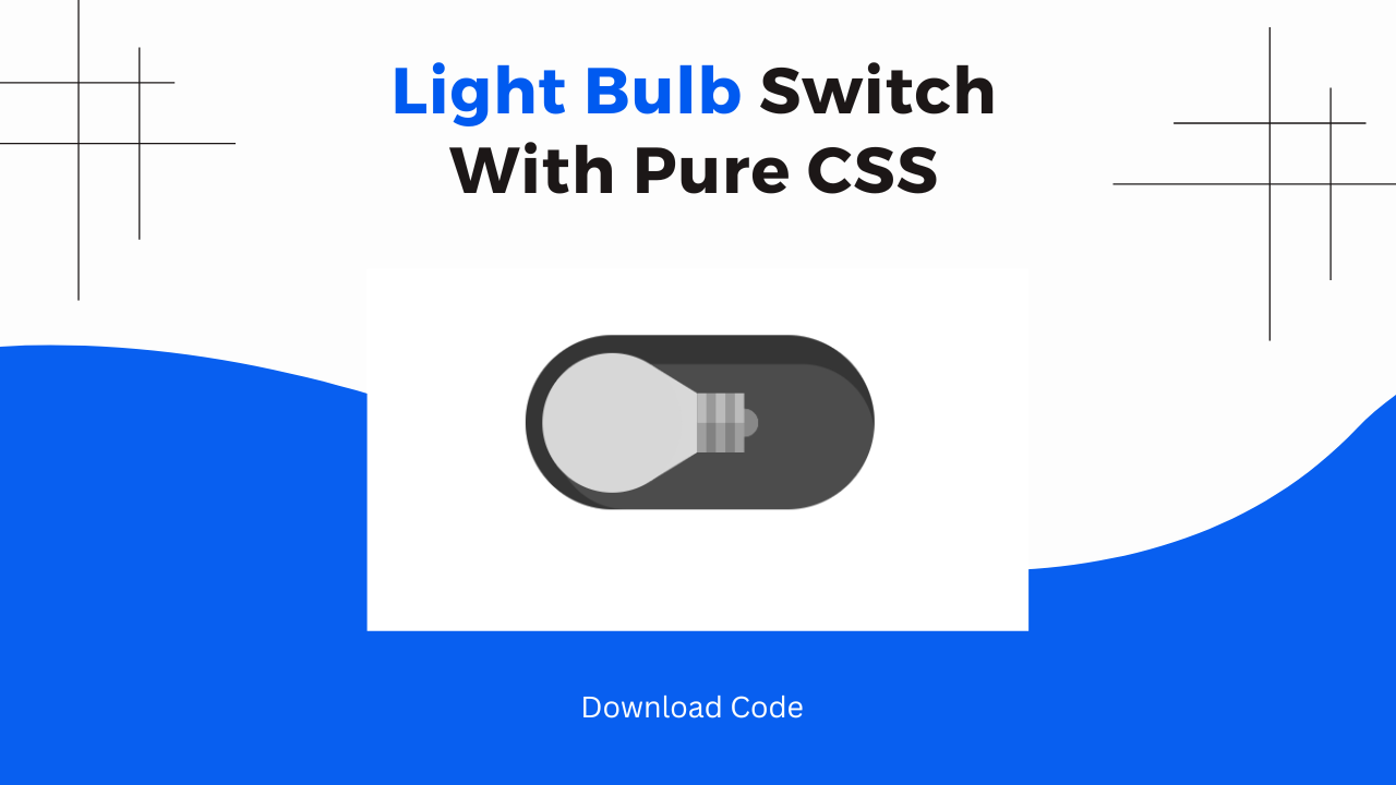
Hey! Frontend web developers. In this blog post, we will make a Light Bulb Switch with pure HTML & CSS. This project mainly focuses on polishing your CSS skills. We will write only three lines of HTML code & the rest of the magic will be done by CSS.
Also Read: Simple Minimal Toggle Switch With Pure CSS
We will also understand each line of CSS code step by step so that you can make this project on your own. At the end of this post, I will share the entire CSS & HTML code so that you can run this project on your local device.
Concepts Used To Make Light Bulb Switch
- CSS Transitions
- CSS Border Radius & Box Shadow.
- CSS Box Modeling & Background, Background Repeat.
- CSS Pseudo Classes Like Checked, Before, After & Focus.
Understanding HTML To Make Light Bulb
The HTML structure is quite simple, containing a main tag that holds an input of type checkbox with a class l.
<main>
    <input class="l" type="checkbox">
</main>
Tags and Attributes:
<main>: This tag is used to wrap the main content of the document. Here, it contains the checkbox input element.<input class="l" type="checkbox">: This is an input element of type checkbox. It has a classl, which will be styled using the CSS provided.
Also Read: Night & Day Mode Toggle Switch With HTML & CSS
Understanding CSS To Make Light Bulb
CSS Styling: Global Settings
The CSS starts with some global styles. It uses the universal selector * along with its :before and :after pseudo-elements to ensure a consistent box-sizing model across all elements. This setting helps in maintaining consistent padding and border calculations, making the layout more predictable and easier to manage.
*, *:before, *:after {
    box-sizing: border-box;
    margin: 0;
    padding: 0;
}
Responsive Font Size
The :root selector defines a responsive font size using the calc function. This calc function adjusts the font size dynamically based on the viewport width.
The calc login scales the font size between 64px and 80px as the viewport width changes from 320px to 960px. As shown in the following code:
:root {
    font-size: calc(64px + (80 - 64) * (100vw - 320px)/(960 - 320));
}
Body and Input Styling
We have given a font size of 1em to the body and input elements, with a line height of 1.5. The body also has a background color of light gray (#bbb).
The input elements are displayed as block-level elements with a margin below them, making them stack vertically with some space between them as you have shown in the following code:
body, input {
    font-size: 1em;
    line-height: 1.5;
}

body {
    background: #bbb;
}

input {
    display: block;
    margin-bottom: 1.5em;
}
Main Container Styling
The main element is styled with padding at the top and centered text alignment. This ensures that the content within the main tag, including the checkbox, is centered horizontally. As shown in following code:
main {
    padding: 1.5em 0 0 0;
    text-align: center;
}
Checkbox Styling: Class l
The .l class, applied to the checkbox, provides the main visual styling. We have given the checkbox a dark semi-transparent background and rounded corners with a border radius.
Which makes it look like toggle a switch. With the help of box-shadow we have added depth.
The checkbox is displayed as an inline-flex container which aligns content properly.
.l {
    background-color: rgba(0,0,0,0.7);
    border-radius: 0.75em;
    box-shadow: 0.125em 0.125em 0 0.125em rgba(0,0,0,0.3) inset;
    color: #fdea7b;
    display: inline-flex;
    align-items: center;
    margin: auto;
    padding: 0.15em;
    width: 3em;
    height: 1.5em;
    transition: background-color 0.1s 0.3s ease-out, box-shadow 0.1s 0.3s ease-out;
    -webkit-appearance: none;
    -moz-appearance: none;
    appearance: none;
}
Pseudo-Elements for Extra Styling
The :before and :after pseudo-elements are used to add visual elements within the checkbox. The :before pseudo-element creates a small circle, which is then styled with CSS to look like the switch handle.
And The :after pseudo-element adds background patterns to enhance the visual effect. That gives the impression of a textured toggle switch.
.l:before, .l:after {
    content: "";
    display: block;
}
Circle Element
The :before pseudo-element is styled to be a small, light-gray circle, placed inside the checkbox. It has rounded corners (border-radius: 50%) and smooth transitions for color changes and movements.
.l:before {
    background-color: #d7d7d7;
    border-radius: 50%;
    width: 1.2em;
    height: 1.2em;
    transition: background-color 0.1s 0.3s ease-out, transform 0.3s ease-out;
    z-index: 1;
}
Background Patterns
The :after pseudo-element adds complex background patterns using gradients. This enhances the visual appearance of the checkbox, giving it a more textured and realistic look. It also moves slightly to the left to create a depth effect.
.l:after {
    background:
        linear-gradient(transparent 50%, rgba(0,0,0,0.15) 0) 0 50% / 50% 100%,
        repeating-linear-gradient(90deg,#bbb 0,#bbb,#bbb 20%,#999 20%,#999 40%) 0 50% / 50% 100%,
        radial-gradient(circle at 50% 50%,#888 25%, transparent 26%);
    background-repeat: no-repeat;
    border: 0.25em solid transparent;
    border-left: 0.4em solid #d8d8d8;
    border-right: 0 solid transparent;
    transition: border-left-color 0.1s 0.3s ease-out, transform 0.3s ease-out;
    transform: translateX(-22.5%);
    transform-origin: 25% 50%;
    width: 1.2em;
    height: 1em;
}
Checkbox Checked State
When the checkbox is checked, the styles change to indicate the new state. The background color becomes lighter, and the shadow effect is reduced. The circle (:before) moves to the right, simulating a toggle switch being turned on. The background (:after) also changes its left border color and rotates 180 degrees, enhancing the toggle effect.
.l:checked {
    background-color: rgba(0,0,0,0.45);
    box-shadow: 0.125em 0.125em 0 0.125em rgba(0,0,0,0.1) inset;
}

.l:checked:before {
    background-color: currentColor;
    transform: translateX(125%);
}

.l:checked:after {
    border-left-color: currentColor;
    transform: translateX(-2.5%) rotateY(180deg);
}
Focus State
The focus state for the checkbox removes the default outline. This is typically done to eliminate the visual focus ring, which can be considered an anti-accessibility practice since it removes the visual indicator for keyboard navigation. However, for this demo, it simplifies the design by removing the outline.
.l:focus {
    outline: 0;
}
Also Read: Simple Minimal Toggle Switch With HTML & CSS
Source Code Of Light Bulb Switch ( HTML & CSS )
HTML:
<main>

    <input class="l" type="checkbox">

</main>
CSS:
<style>

    *, *:before, *:after {

    box-sizing: border-box;

    margin: 0;

    padding: 0;

}

:root {

    /* minFontSize + (maxFontSize - minFontSize) * (100vw - minVWidth)/(maxVWidth - minVWidth) */

    font-size: calc(64px + (80 - 64) * (100vw - 320px)/(960 - 320));

}

body, input {

    font-size: 1em;

    line-height: 1.5;

}

body {

    background: #bbb;

}

input {

    display: block;

    margin-bottom: 1.5em;

}

main {

    padding: 1.5em 0 0 0;

    text-align: center;

}

.l {

    background-color: rgba(0,0,0,0.7);

    border-radius: 0.75em;

    box-shadow: 0.125em 0.125em 0 0.125em rgba(0,0,0,0.3) inset;

    color: #fdea7b;

    display: inline-flex;

    align-items: center;

    margin: auto;

    padding: 0.15em;

    width: 3em;

    height: 1.5em;

    transition: background-color 0.1s 0.3s ease-out, box-shadow 0.1s 0.3s ease-out;

    -webkit-appearance: none;

    -moz-appearance: none;

    appearance: none;

}

.l:before, .l:after {

    content: "";

    display: block;

}

.l:before {

    background-color: #d7d7d7;

    border-radius: 50%;

    width: 1.2em;

    height: 1.2em;

    transition: background-color 0.1s 0.3s ease-out, transform 0.3s ease-out;

    z-index: 1;

}

.l:after {

    background:

        linear-gradient(transparent 50%, rgba(0,0,0,0.15) 0) 0 50% / 50% 100%,

        repeating-linear-gradient(90deg,#bbb 0,#bbb,#bbb 20%,#999 20%,#999 40%) 0 50% / 50% 100%,

        radial-gradient(circle at 50% 50%,#888 25%, transparent 26%);

    background-repeat: no-repeat;

    border: 0.25em solid transparent;

    border-left: 0.4em solid #d8d8d8;

    border-right: 0 solid transparent;

    transition: border-left-color 0.1s 0.3s ease-out, transform 0.3s ease-out;

    transform: translateX(-22.5%);

    transform-origin: 25% 50%;

    width: 1.2em;

    height: 1em;

}

/* Checked */

.l:checked {

    background-color: rgba(0,0,0,0.45);

    box-shadow: 0.125em 0.125em 0 0.125em rgba(0,0,0,0.1) inset;

}

.l:checked:before {

    background-color: currentColor;

    transform: translateX(125%)

}

.l:checked:after {

    border-left-color: currentColor;

    transform: translateX(-2.5%) rotateY(180deg);

}

/* Other States */

.l:focus {

    /* Usually an anti-A11Y practice but set to remove an annoyance just for this demo */

    outline: 0;

}

</style>
Last Updated: June 18, 2024
